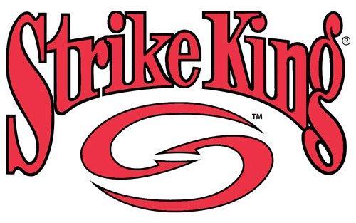
Strike King announced their new logo as part of the evolving and expanding company line of products. Their original local was related to baits and as they move into apparel, sunglasses and other fishing related items they dropped the lures and baits tags from their logo and also updated the logo with a double hook design in an oval. What do you think of the new logo? Like it or prefer the old one?
Strike King Releases New Logo
- Wired2fish Editors
- Feb 13, 2014


