More than we need. That’s often what comes on a lot of the latest gadgets and gizmos. But if you’re like me, you have techno-joy and love that most things, especially our fishing electronics, come with more than we think we need. Probably the most frequent question folks ask involves choosing the best color palette for my fish finder.
Fortunately a lot of the options available to us in fishing have more to do with personal taste than scientific reasoning. The color of a crankbait that I think is magical might look like barf to another angler. With the color palettes on Side Scan, Down Scan and sonar, anglers can choose the best palette based on several variables including:
- Eyesight
- Daylight
- Bottom Composition
- Cover
One critical factor to remember is that as you change color palettes you need to pay attention to your sensitivity and contrast. They need to be adjusted for each palette so you’re getting the clearest picture in that palette.
Seeing is believing
A big variable from angler to angler has nothing to do with personal preference but rather our own makeup. Eyesight comes and goes with age. Some of us were blessed with poor eyesight from the get go. Some of us see only grey. Some of us can’t discern between certain color palettes and shades. For this reason, there are several options for varying eye sights from black and white to bright green or red.
“Guys that are color blind often choose options 1 and 2, the black and white palettes, on their Lowrance HDS units,” said Chris Meyer, Dealer Trainer and Field Tester for Lowrance. “I prefer 6 and 9 on the Gen 2 Units and palette 7 on the new Touch units. But that’s the beauty of it. It’s a personal preference and there are enough options that someone who sees red better than green might have a better view with one palette or the other.”
Dawn to dusk
At certain times of the day certain color palettes seem to be more visible. In low light, the brighter palettes like the greens, reds and blues seem more visible. In direct sunlight it seems like the browns and oranges and light blue is real visible.
Bugs become a common problem at dusk and into the night. When this is the case, Meyer switches his graph to the bright green screen and the bugs are not attracted to your graphs like they are with big white or light backgrounds.
Identifying objects
Since contrast needs to be adjusted depending on the color palette, it stands to reason certain things on the bottom tend to show up better in certain palettes. Rocks show up well on the darker palettes while wood shows up better on your fish finder’s lighter palettes.
[READ: Clean Up Your Fish Finder’s Picture]
Do more
On sonar I simply choose Palette 1 on my Lowrance HDS units. Yellow is hard, blue is soft and it keeps it all pretty simple.
But I do change palettes more with side imaging depending on how bright it is outside, how fatigued my eyes are from staring at a screen, how bad the bugs are in low light conditions, and what I’m actually looking for on the bottom. As I do I constantly keep an eye on my contrast to make sure areas aren’t blown out as I switch palettes.
You spend a lot of money for good fish finders these days and you need to get the most out of them. You can see bass others miss just by having your units optimized and doing more than just one thing.
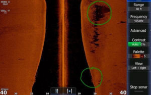
Take this image for example. I got in on a steep ledge a few weeks ago I was scanning with one palette and felt like I wasn’t seeing it all, so I switched colors and bumped the sensitivity actually down with the contrast option and saw some fish suspended right off the break in the shadow of the rocks.
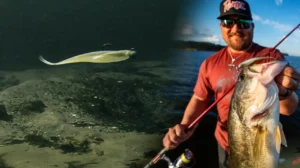
I spun the boat around fired my bait into the area and proceeded to catch 8 bass in a row that were suspending off the ledge over open water. Right as my bait cleared the ledge, a fish jumped all over it. I would have missed those fish if I hadn’t made a slight change at the right time. Today’s depth finders / chartplotters can improve your fishing a lot and you owe it to yourself to do more with them.


